HowAboutWe is a dual product which caters experiences to singles and couples. The idea behind the product, one would find a match using the dating site, and continue to keep the spark alive with the help of the couples platform which offers date recommendations. HowAboutWe for couples offered a unique datebooks in five major cities. The subscription-based service uncovered local gems at discount prices.
Notifications
I was tasked with was creating a notification system that would prompt members with date itineraries, partner activity and important information about their accounts. This was meant to be a persistent element that would appear on every page a user would visit. It was important to convey urgency when appropriate and serve a convenient interface to take action on important items without distracting from the overall experience.
Featured Datecards
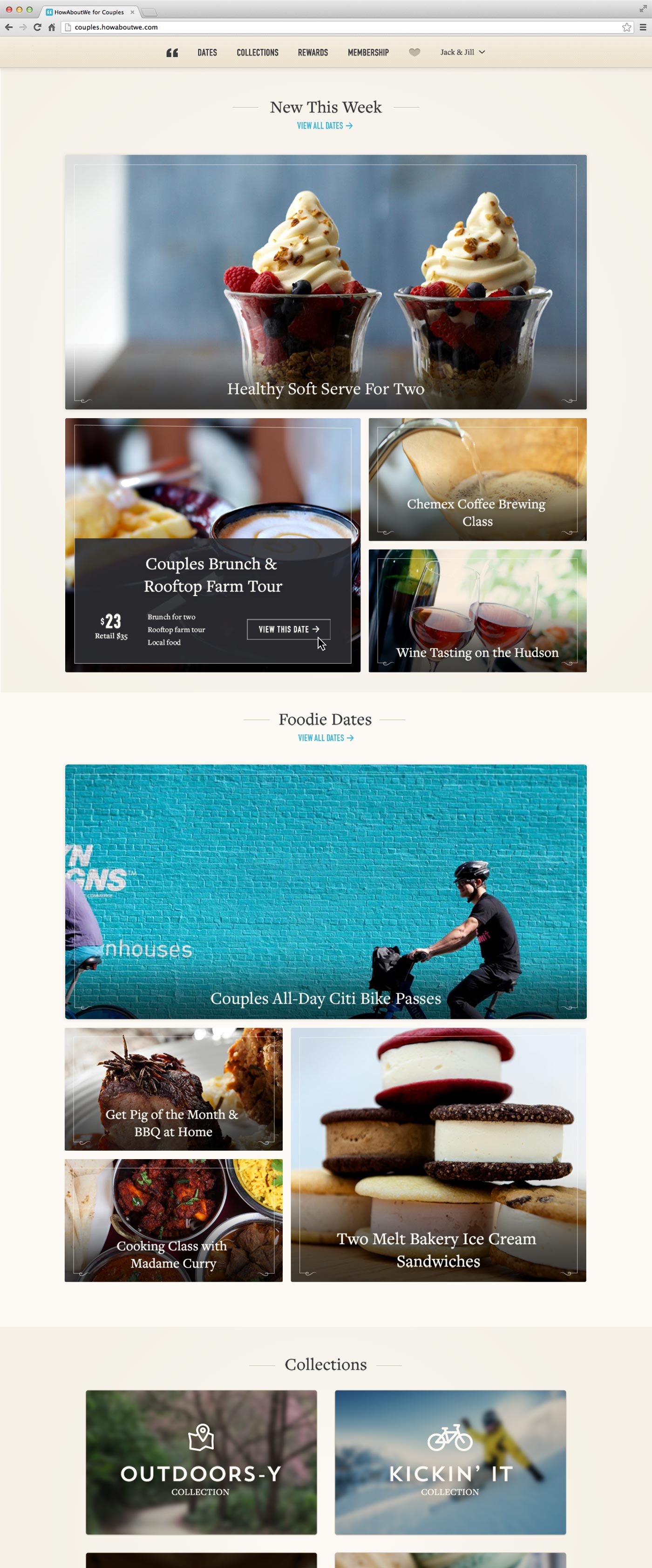
Dates were presented with strong visuals and high-level information a user might need to inform a date decision. We originally had all of the dates in a ‘datebook’ with smaller datecards of equal weight. I was tasked with designing a new page for the product where we would showcase ‘featured’ dates. This would eventually be a/b tested and set as the couples site’s new landing page. This page was intended to serve up dates that might be of interest to particular users based on past behavior as well as promote featured or sponsored dates that needed more real estate.
Below are a number of wireframe options I devised before moving on to the final visuals.
Editorial site launch
I was responsible for designing a cohesive experience across four media sites — Nerve, Swimmingly, The Date Report, and Famously, for HowAboutWe Media. Design work included all aspects of the product design and flow including homepage, category and article pages.
Neighborhoods
Another card UI design project I worked on is displayed above. This involved adding 'date neighborhoods' to our existing standard datecards. It became increasingly important for our users to know the neighborhoods dates were in upon first glance to avoid excess clicks. Design was to retain our card size, image aspect ratios and existing date details while adding a dynamic text area for neighborhoods.


